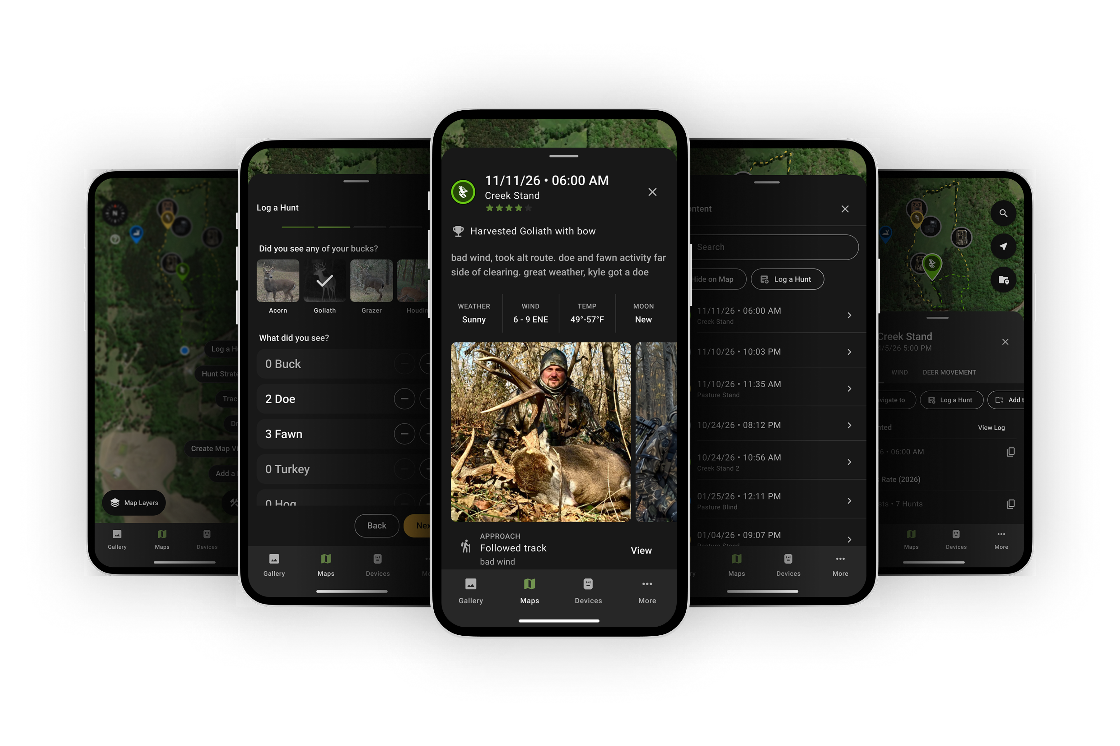
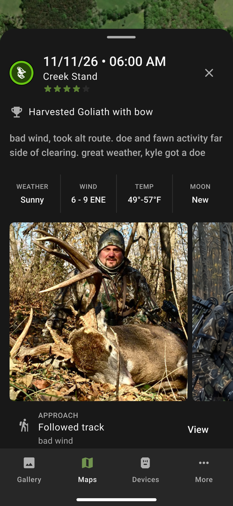
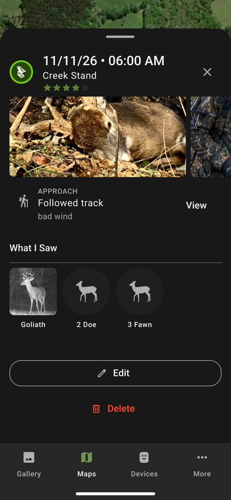
Hunt Log lets hunters record where they sat, how they walked in, what they saw, and whether they took a shot. Those records are also meant to be one of the main sources of training data for the company’s planned AI hunt planning product. So the feature only works if a lot of hunters use it, and keep using it. I pushed for a usability study before development to find out whether they would.
Problem
Trail cameras only know what walks past the sensor. They miss the buck that showed up at 1:30 just out of range, the stand that went cold after three sits in a row, and the pressure that pushed deer off a field they normally use. Hunters see all of that from the stand. Our app had nowhere to put it.
For Moultrie, that gap matters more than it used to. The company is building an AI product that recommends when and where to hunt, and its recommendations can only be as good as its data on real hunt outcomes. Hunt logs are how that data gets in. The product owner’s scope set the targets at 5% of users logging at least one hunt in the 2026 season, and 15% opening their end-of-season recap.
That puts a lot of weight on a form. Every extra field or confusing step means fewer logs, and fewer logs means weaker recommendations.
Making the Case for Testing
Usability testing wasn’t in the plan, and nobody asked for it. I designed the Hunt Log flows in Figma while the scope was being written, and the next step was development. But I saw Hunt Log as one of the pieces the company’s AI initiative would succeed or fail on. A logging form people abandon doesn’t just fail as a feature. It leaves the AI product without the data it needs. Getting the form as close to frictionless as possible before development was worth the time.
So I didn’t wait for permission. I let the product owner and stakeholders know I was running a study, then kept the product owner updated as sessions came in. He was very interested in what we were finding. I built the study around four questions:
- Is the form balanced between the data the AI needs and the effort it asks of hunters?
- Which fields add friction without adding value?
- What could Hunt Log show back to hunters to make them log again?
- Is the updated drawing tool clear about the difference between a line and an area?
The last one came along for the ride. To make room for Log a Hunt in the map’s tools menu, we merged the separate line and area tools into one.
We went in with two hypotheses. The drawing tool would be highly intuitive. And hunters would like Hunt Log but not use it habitually, because they wouldn’t see what they got back for the effort.
I also saw the study as a chance to try a new way of prototyping.
Building a Prototype That Worked
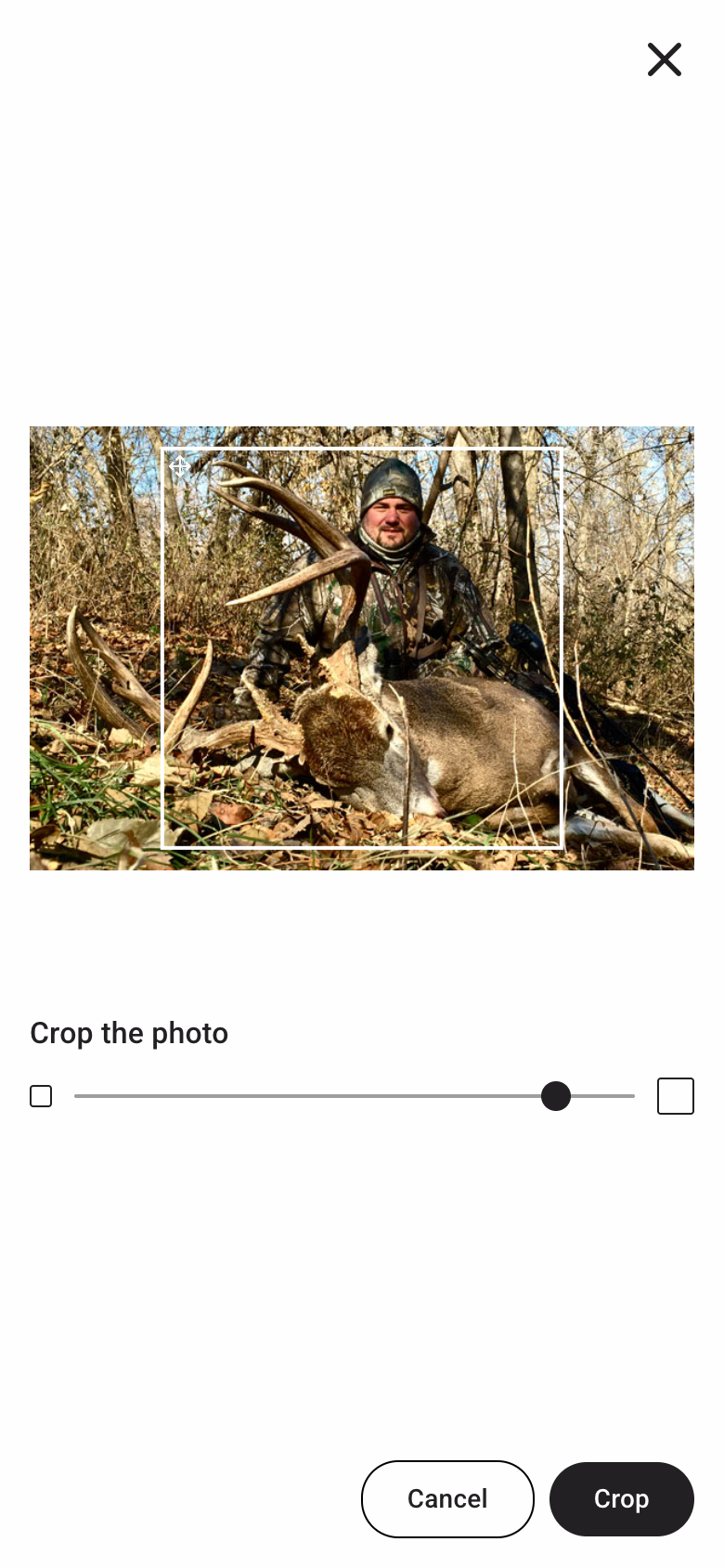
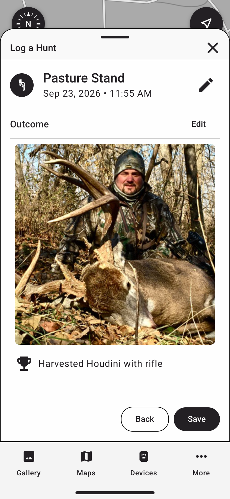
A linked Figma prototype couldn’t test what this study needed. Testers had to log a hunt, then come back later and edit that same hunt. They needed to upload a real photo from their phone, pan around a map, and watch a measurement update as they drew. Linked screens can fake a happy path. They can’t fake saved data.
Saved hunts showed up on the map and in lists, and the summary pulled real past weather for the date and time the tester entered. All four task flows were working two days after the first commit.
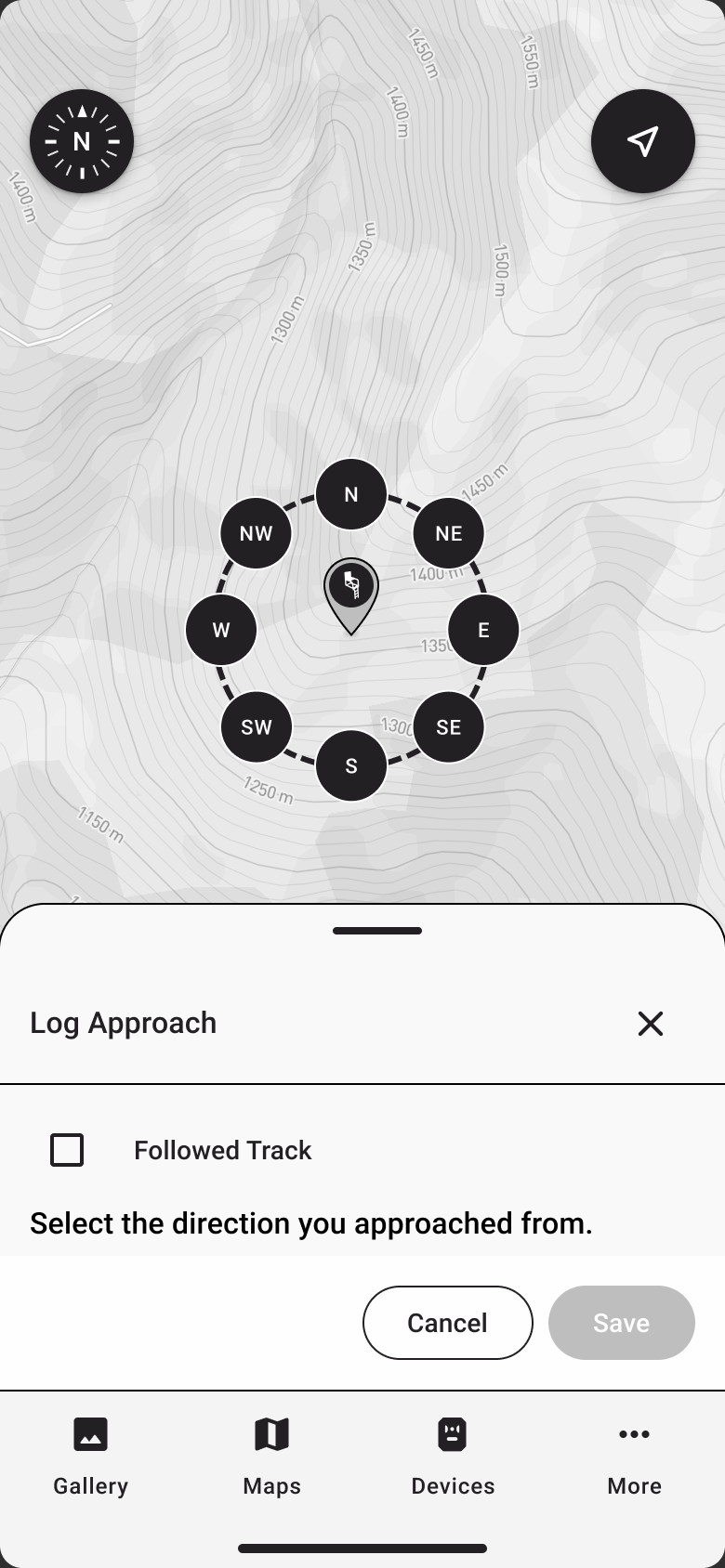
The AI tool didn’t get everything right. It placed drawing points by tapping the map, which isn’t how the live app works, so I corrected it to the real model of a fixed crosshair you pan the map under. Testers needed to be reacting to our design, not the prototype’s quirks.
When Unmoderated Testing Broke
My first plan was an unmoderated study on our existing Maze account, with heatmaps showing where testers tapped. Unmoderated testing would have reached more hunters with less of the team’s time. I gave every task its own URL and added Maze’s heatmap snippet to the prototype so it could follow each tester’s path.
It didn’t survive the dry runs. On iOS, the heatmap data collection crashed the Maze test, and teammates couldn’t get through it. Hunt Log is designed for phones, so a test that broke on iPhones wasn’t usable.
I took the Maze code out and made every task start from the map, the same way the real app works. Before the first session I also caught a bug that would have undermined the study. The edit task loaded a hard-coded sample hunt instead of the one the tester had just logged, and edits didn’t save. Testers would have logged a hunt, then been asked to edit someone else’s.
The Study
I ran six 45-minute think-aloud sessions with hunters from our research panel, three from the southeast, two from the northeast and one from the northwest. They shared their screens and worked through five tasks, then answered seven debrief questions. A UX researcher reviewed my test plan, and a senior researcher co-moderated some of the sessions.
- Find a hunt you logged a few weeks ago.
- Log a morning sit.
- Add notes to a hunt you logged earlier.
- Measure the distance between two of your stands.
- Mark a food plot as an area.
I wrote each task as an outcome, not an instruction, so none of them named a button or a screen.
What We Found
Logging Was Easy
Every tester completed a full log without friction.
”You can’t get any easier, man.”
The friction lived at the edges. Three of the four first-round testers expected one edit button for the whole log and were thrown by the separate edit links on each section. All four looked in My Content first when they went to start a new log, which was where they’d go to find one, but not where we’d put the button to create one.
The Reason to Log
Our second hypothesis mostly held. Everyone saw value in Hunt Log, but when we asked how often they’d realistically log a hunt, 4 of 6 said “sometimes.” Every one of them currently kept their hunt history in their head.
The surprise came in the debrief. I asked testers how they’d feel knowing their logs would power AI hunt planning recommendations. One who had said “I’d probably use it sometimes” changed his answer on the spot.
”I would change my answer. I’d more than likely use it almost every time I went… so the data would be there, so it would help me have a better success rate.”
Our least motivated tester, who had said he’d rarely log, answered “No, I love that idea.” I asked every tester directly whether AI using their data bothered them. Every one said no.
That changed what I thought the problem was. We had treated the AI as Moultrie’s reason for Hunt Log, and the personal record as the hunter’s reason. For the hunters least likely to log, the AI was their reason too. The business goal and the user’s motivation were the same thing, and nothing in the design said so.
Lines Worked. Areas Were Hidden.
The first hypothesis was half right. All six testers measured a distance quickly, and several volunteered real uses for it, like ranging shots, planning drag-out routes and spacing stands safely.
Areas were a different story. Asked to “mark” a food plot, four of six reached for a pin first. To a hunter, marking something means dropping a pin. Once they found the area tool, closing the shape worked well, even though I’d left out any text explaining how. The only cues were a target around the first point, a dashed preview line, and a button that changed from Drop Point to Close Shape. “That snap… that’s what I’m expecting,” one tester said.
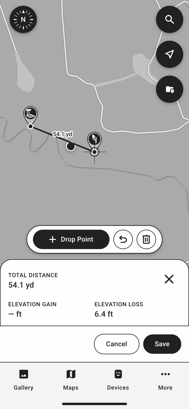
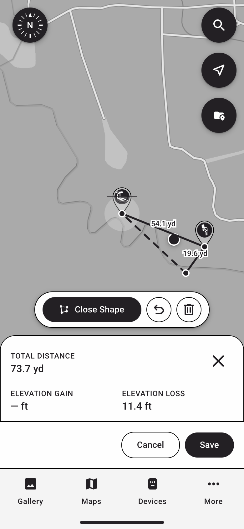
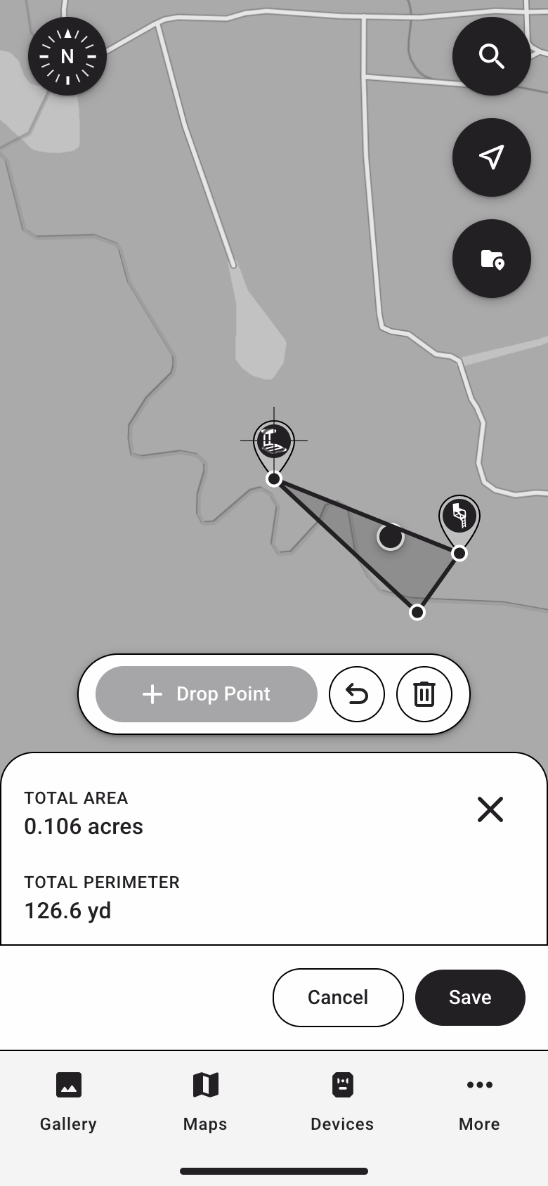
Every drawing struggle happened on a laptop. All three phone testers finished both drawing tasks without friction.
Changing the Design Mid-Study
After four sessions the same problems kept coming up, and there was no time on the schedule for a second round. Because the prototype was code, I didn’t need one. I built the fixes and deployed them the same day, then tested them with the last two testers.
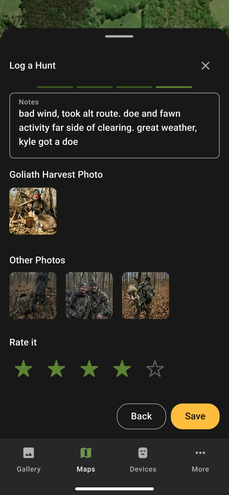
- A second way to start a log. Since everyone looked in My Content first, I added a Log New Hunt button to the Hunt Logs list.
- Drop a New Pin in the location list. The pin button in the corner was too easy to miss on its own, so logging a hunt away from a stand moved into the location dropdown.
- Buck count separated from Buck List. Tapping a named buck from the hunter’s Buck List was quietly adding one to the buck count. I split them and moved the Buck List question to the top of the step. This came from what I watched testers do, not anything they said, so I flagged it as a call to keep an eye on.
- Stars instead of emoji. The trip rating went from a 1 to 5 emoji scale to three stars on its own step. One tester had said he didn’t know if he’d really click an emoji.
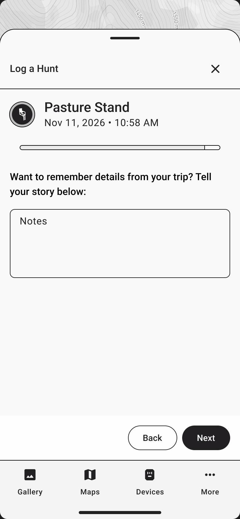
- A notes prompt that asks for a story. “Additional notes” became “Want to remember details from your trip? Tell your story below.”
- Phones only. Laptops were distorting a phone design, so the last two sessions were on phones.
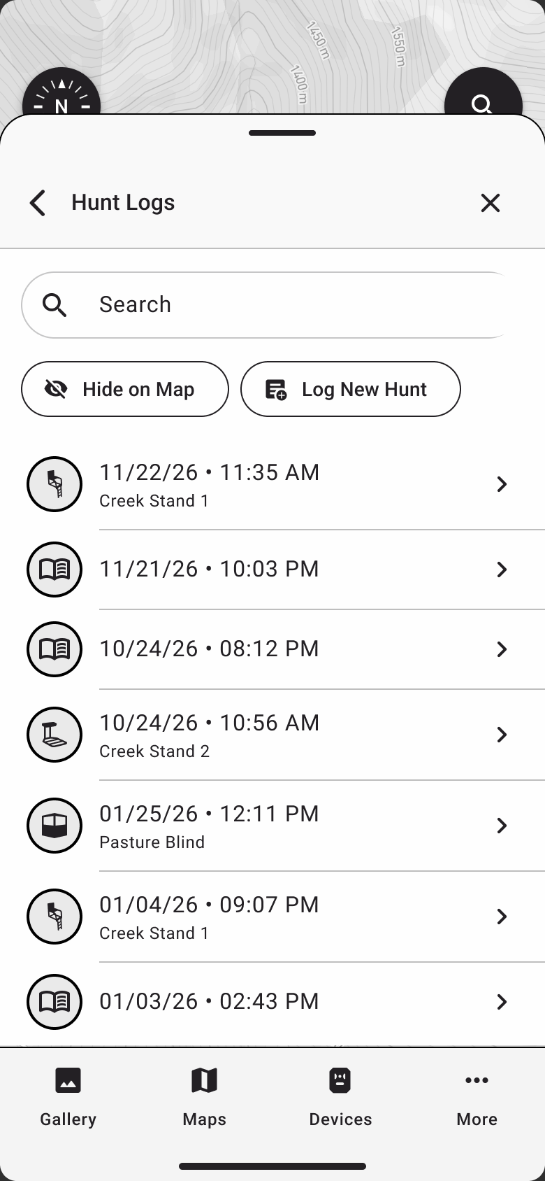
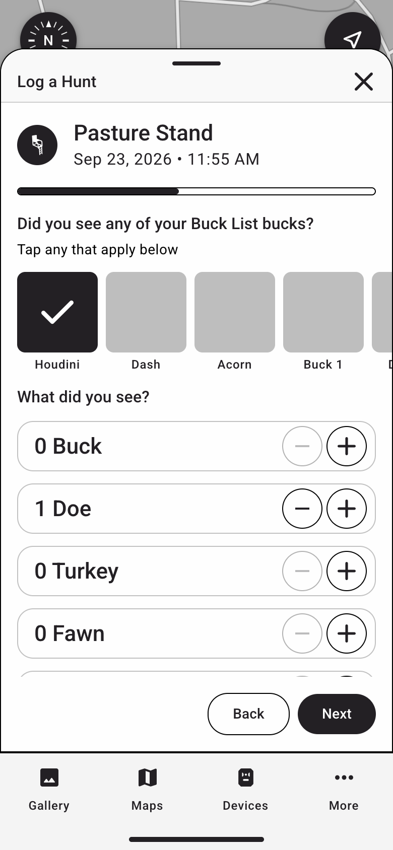
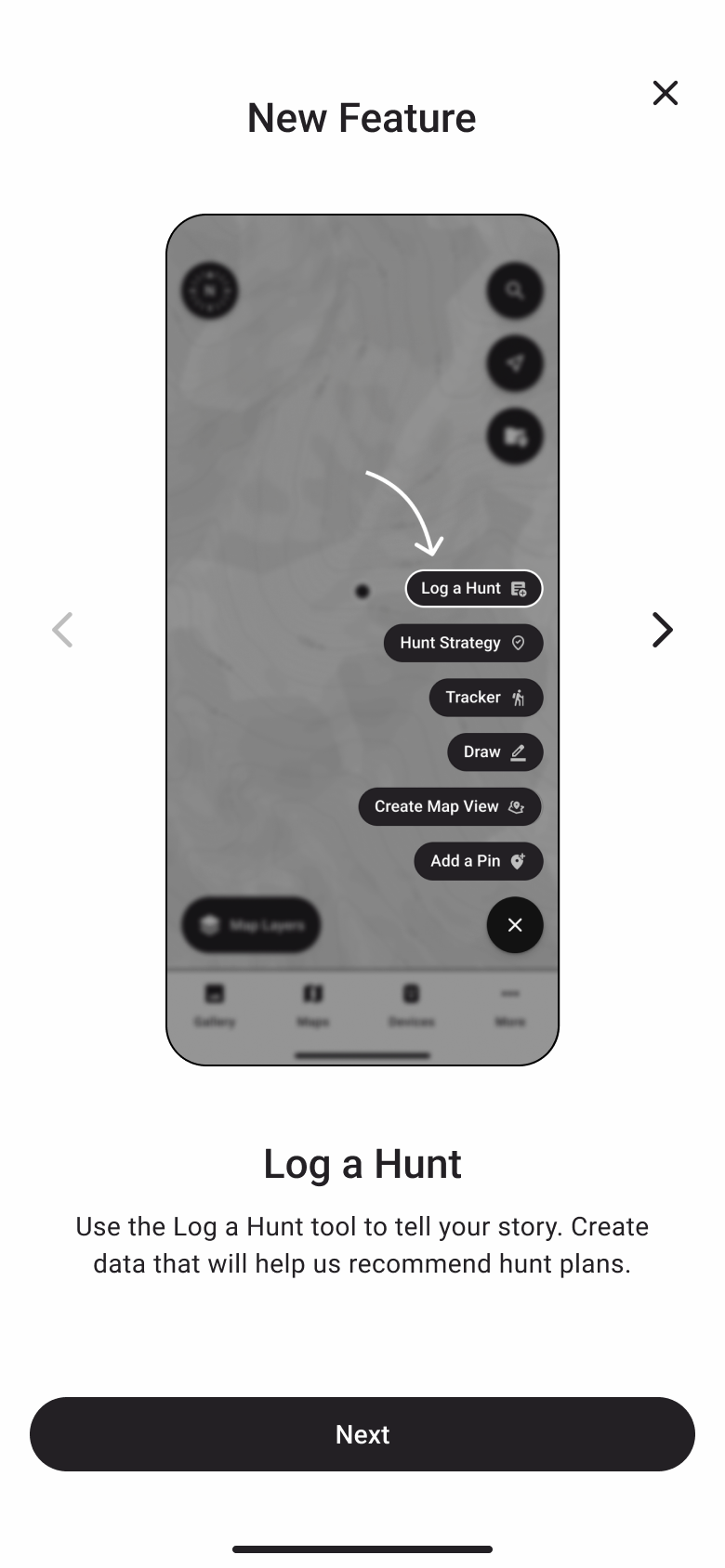
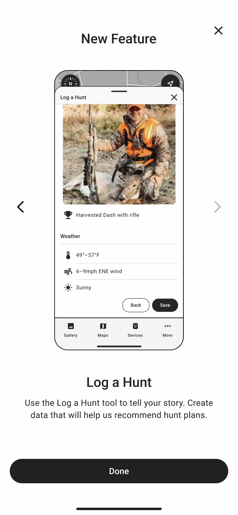
The biggest addition was a two-screen New Feature intro that explained the AI benefit up front. The results were mixed. One tester understood it right away. The other thought the feature was for coordinating future hunts with friends. My co-moderator pinned down why in our debrief. The copy sold a future benefit, planning, for something the hunter does about the past. And the tester who misread the screen was the same one who changed his answer once I explained the AI benefit in conversation. The message worked. The screen didn’t carry it yet.
Two sessions isn’t proof, and I presented the version 2 results as directional. But the fixed design produced fewer misconceptions, fewer roadblocks and more buy-in. Notes went from mostly skipped to filled in without prompting.
Outcomes
Hunt Log is now in development. My co-moderator and I presented the findings to stakeholders, with usability issues separated from product questions, and they were thrilled with the study. Every recommendation was picked up. That included the mid-study fixes, plus one consistent edit button, bringing back View More in the sightings list after flattening it hid how long the list was, auto-capturing moon phase, and room for more than one photo per log.
One change moved past what we tested. The final design keeps stars for the trip rating but uses five instead of three, because a five-point scale gives the AI team more usable data. Testers got the stars they preferred, and the data got the range it needed.
The one exception was the intro screen itself. Based on its mixed results, the team is going with different copy than the version we tested. The idea behind it stayed. The AI benefit is the strongest reason to log, so the product has to say so.
The prototyping method outlived the study. I trained another designer on it, and she has since run three unmoderated studies with coded prototypes, using Maze’s screen recording instead of heatmaps. The team is now building an in-house platform that hosts every active prototype with its tasks and tracks results, and Hunt Log was the first study connected to it.
Reflection
I’d test on phones only from the start. Allowing laptops made recruiting easier, but it muddied the drawing results for half the study. I’d also try any third-party script on a real phone before building a study plan around it.
The open problem is still the intro. New copy should help, but telling hunters about a benefit they won’t see until the AI ships is hard, and one screen at the start of a feature is a thin place to do it. The next study should test the message at the moment it matters most, right when a hunter saves a log and wonders whether it was worth the effort.