Designing Buck List

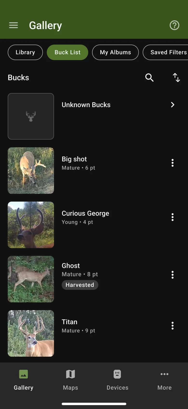
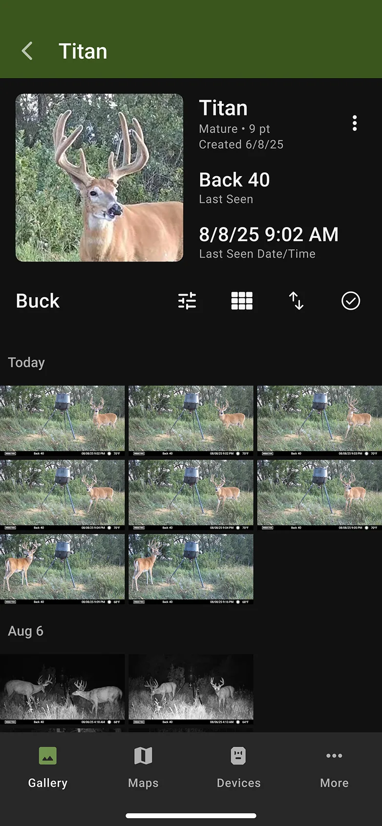
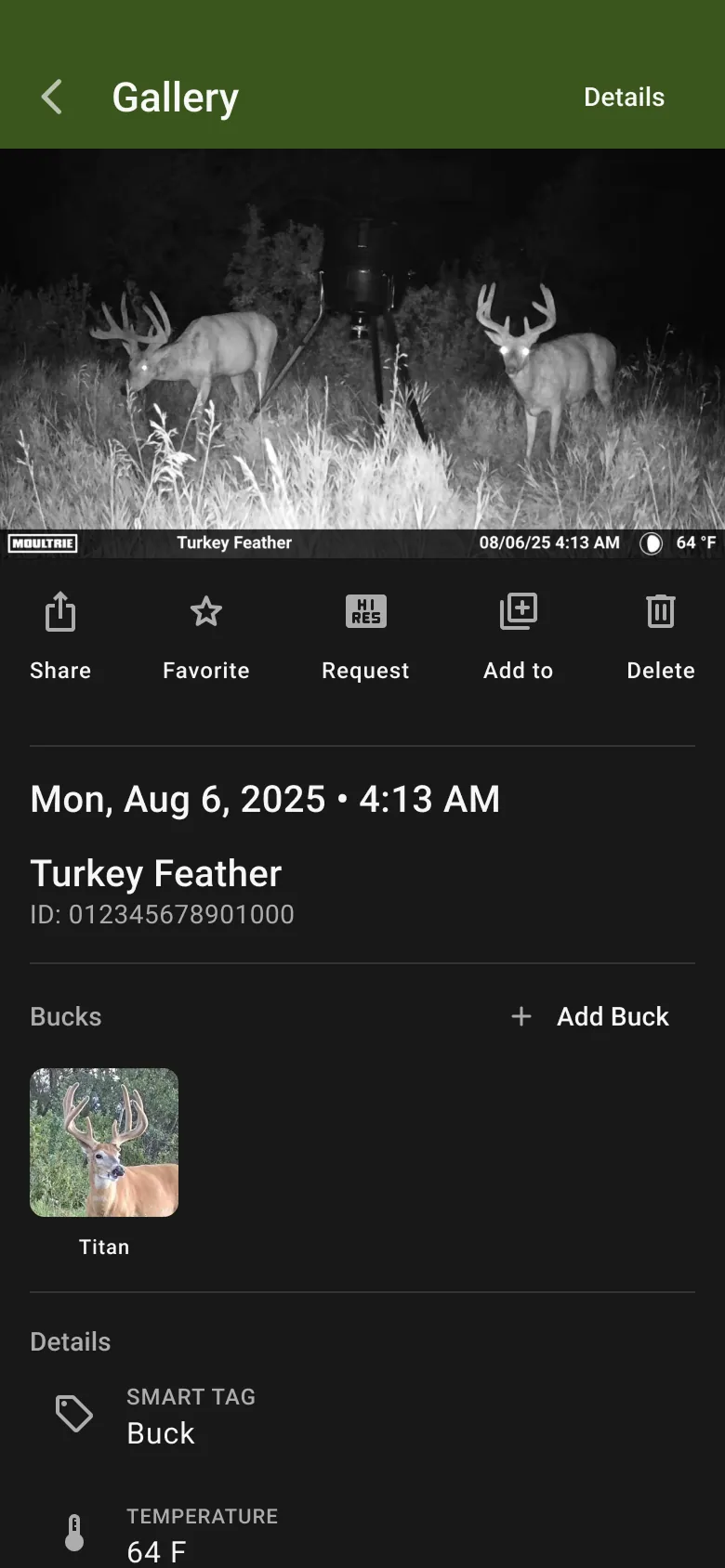
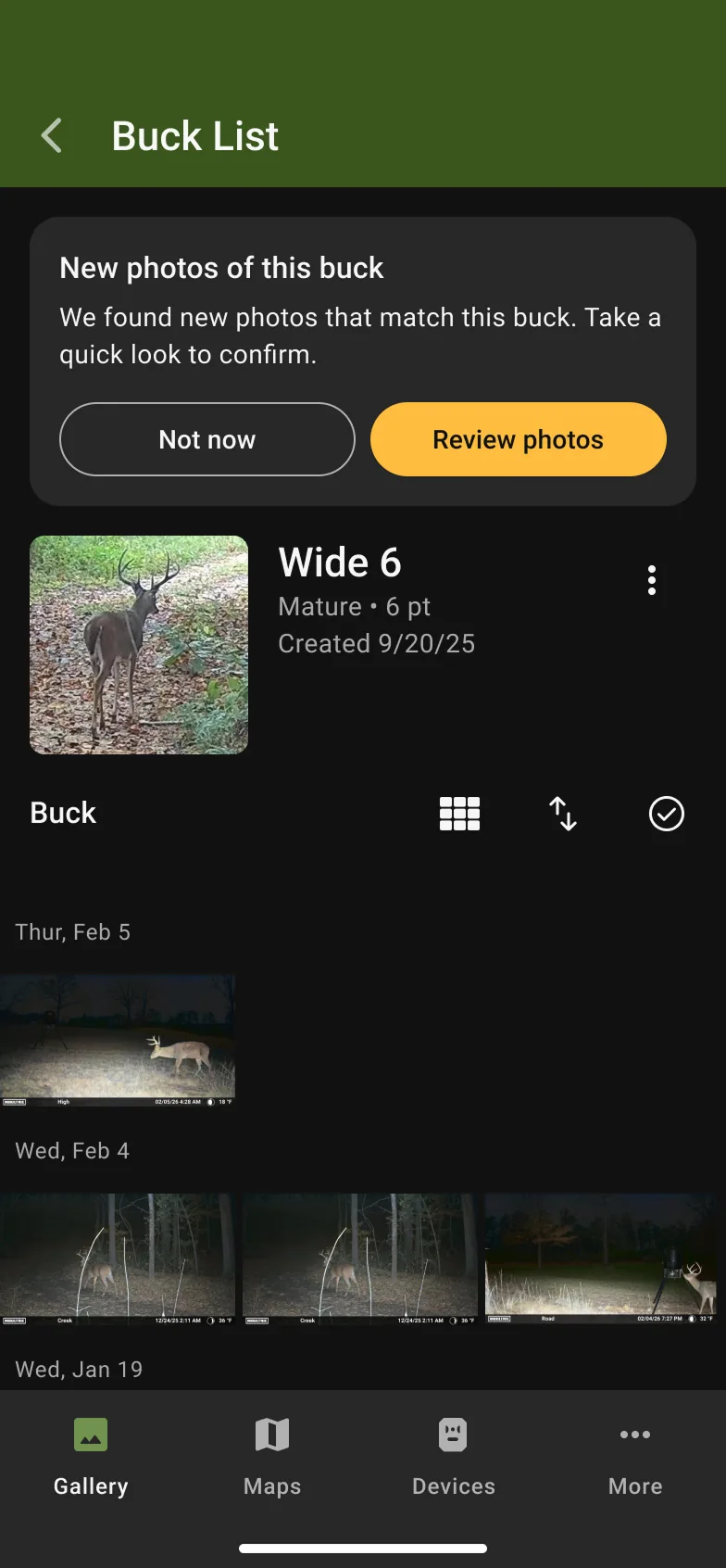
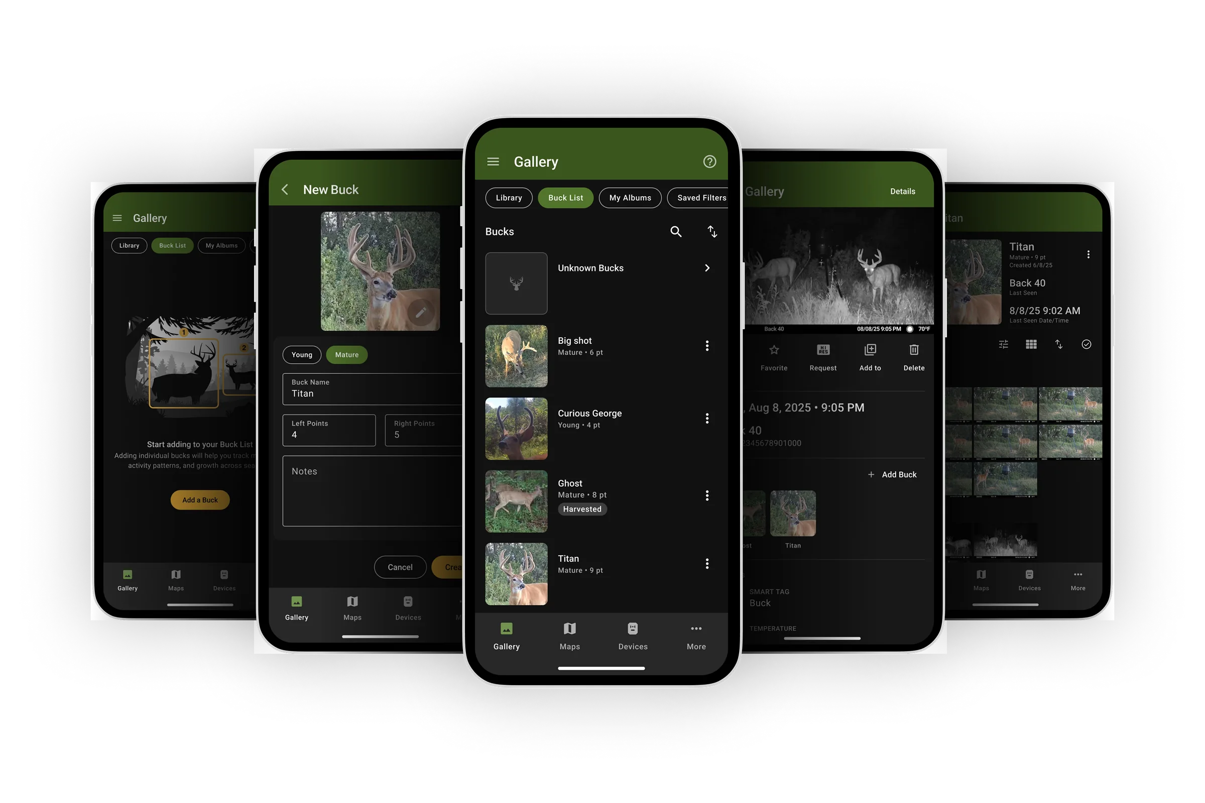
Buck List hero — buck profile screen in the Moultrie app
role Product Designer (design lead)
timeline April to August 2025
team 2 Designers, Product Manager, Engineering, Machine Learning
skills
Product DesignUser ResearchUI/UXFeature Design

Launched Buck List, a system for identifying and tracking individual bucks across trail camera images. I led design for the feature and owned the design decisions, working closely with a second designer through exploration.

27% vs 30% target
adoption
300,000+ vs 10,000 target
bucks identified
2.7 → 4+
images per buck

Every profile users built also fed a structured dataset for AI-assisted identification, planned for release this coming season. That was the design strategy from the start: Phase 1 had to be worth using on its own, and it had to generate the training data Phase 2 needs to exist.


Problem

Hunters are more likely to hunt a trophy buck successfully if they understand that buck’s movement patterns. A big part of that understanding is knowing when and where an individual buck shows up in trail camera pictures, and hunters form their strategies around the patterns they see in that data.

The data is a lot to digest, and our app had no tools for collecting or categorizing it at the level of an individual animal. Hunters were working around the gap with basic photo albums.

For Moultrie, the gap was also a business problem. The premium hunt planning subscription is built on helping hunters make better decisions, and individual buck tracking was a core hunter behavior the subscription didn’t touch. Solving it well would deepen what the subscription offers, and it would unlock something bigger: a structured dataset that could eventually power AI identification, which no album workaround could ever produce.


Where This Started

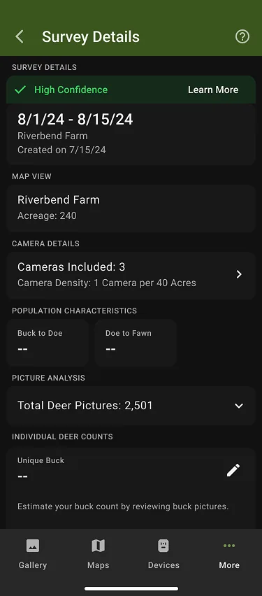
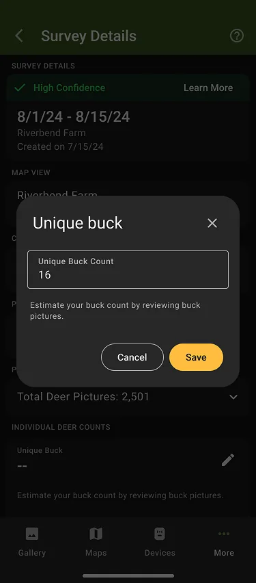
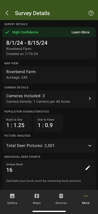
Buck List grew out of design exploration I was doing for a different feature. Deer Survey had shipped on mobile, giving users population estimates derived from a single input: a manual count of unique bucks across a set of images. The mobile flow asked users to review images in the gallery, then return to the survey to type in a number.

1st screen in Deer Survey mobile manual buck count flow2nd screen in Deer Survey mobile manual buck count flow3rd screen in Deer Survey mobile manual buck count flow
Deer Survey's original mobile flow: review images in the gallery, then return to type in a count.

Designing Deer Survey for web, I wanted to streamline that review process, so I designed tools for categorizing images into persistent buck profiles that could hold tine counts, notes, and a name. When I presented the work to stakeholders, the profiles concept changed the conversation. Leadership saw more customer value in tracking individual bucks than in the survey feature itself. Deer Survey for web went to the backburner, and the roadmap was reprioritized around what became Buck List.
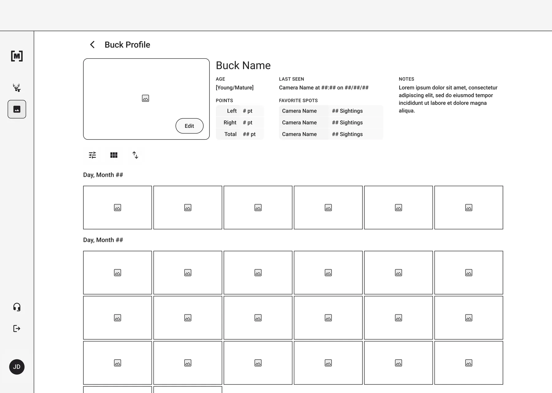
The exploration wasn’t assigned. It surfaced an opportunity that shifted what the team built next, which is part of why I think speculative design work inside a real project is worth the time it takes.


Research

I inherited findings from an internal Moultrie survey of 3,844 deer hunters, which put numbers to both the behavior and the opportunity. The average user sees about 5.5 unique bucks in a season. 67% keep a seasonal target list, and 73% of those manage it with a photo album on their phone or computer. A Kano analysis showed that both manual and AI-assisted identification were attractive but unexpected, with 92% saying they were likely to use either.

My job was turning those findings into design priorities. Two stats did most of the work:

85%
wanted time-of-day for a specific buck
77%
wanted to know which cameras a buck appears on

The first finding directly drove the decision to lead every profile with last-seen time. The second drove leading with last-seen location alongside it. Both needs share a requirement: a system that connects images to individual animals over time. That requirement is what shaped the product approach.


Product Approach

We built Buck List as a system for identifying and tracking individual bucks across trail camera images, and across multiple seasons. Each profile is a persistent record of a single animal, collecting images and activity over time.

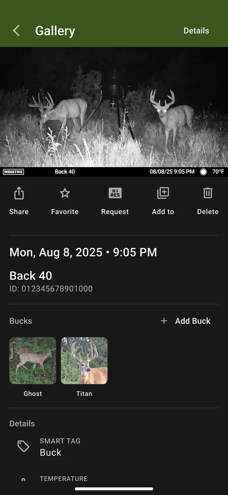
Phase 1 is manual. Users review recent images, assign them to profiles, and build a record of which bucks are on their property. Each profile captures a tagged image gallery, a profile photo, antler point counts, notes, and automatically surfaces when and where the buck was last seen. Phase 2 uses AI to suggest matches between new images and existing profiles and to flag potential unknowns, with users confirming before anything is applied.

The relationship between the phases is the core of the design strategy. Phase 1 is not a placeholder until the AI arrives. The tagging users do in Phase 1 is the training data Phase 2 depends on, which meant every friction decision in the manual experience was also a data quality decision.

A manual flow that users abandon doesn’t just fail on its own terms. It starves the model.

Definition of Success

The product owner set three targets in the initial one-pager:

  1. By the end of the 25-26 whitetail season, 30% of users have created at least one buck profile.
  2. By February of CY26, at least 10,000 unique, useful bucks identified, where “useful” means tagged in more than one setting and at more than one time of day.
  3. CSAT for users of Buck Profiles measures 10% higher than for non-users in gallery surveys.

These targets shaped the design priorities. The 30% adoption bar meant profile creation had to be nearly effortless. The “useful bucks” definition meant the system had to encourage repeat tagging over time, not one-and-done profiles.


Design Decisions

Designing the Profile

The priority when designing the profile was minimizing friction. The more effort profile creation requires, the fewer profiles users make, and a thin dataset going into Phase 2 is a problem.

considered An exact age year field — hunters do think about a buck's age when deciding whether to target it.
chose A simple toggle between young and mature.
why Estimating age from a trail camera image is genuinely uncertain. Asking users to enter an exact year produces guesses more than data. The toggle captures the decision hunters are actually making without asking for precision the images can't support.

The harder question was what to lead with when a user opens a profile. The research answered it: time of day and camera location were the two things hunters most wanted to know about a specific buck, so last-seen time and location lead the profile. If a buck showed up yesterday afternoon on the east side of the property, that is what a hunter needs before going out. Historical pattern data is still there. It just doesn’t lead.

A Workflow Built for Volume

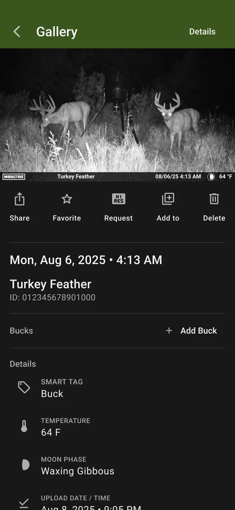
Hunters reviewing images from a session might be sorting through hundreds of photos, almost always on a phone. I designed the flow around newly detected images. Users can triage in bulk when the context is clear, which is common when a buck has been loitering near a feeder and appears across a run of consecutive images. For harder calls, they step into individual photos and take a closer look.

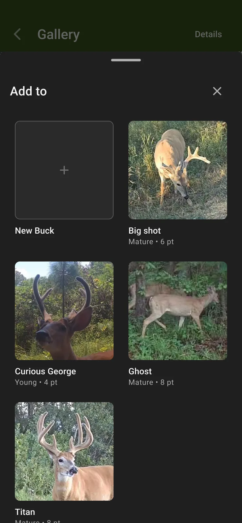
The harder part was giving users something to compare against when an image wasn’t obvious. Fitting two trail camera images side by side and expecting users to read subtle biological cues like tine count, spread, and brow tine shape is asking a lot on a phone screen. We solved it with a flyout sheet of profile pictures. Users can pull it up while viewing a new image, browse their existing bucks, and dismiss it when ready. The tradeoff: for a hard identification, asking users to hold an incoming image in memory while browsing the flyout is a real limitation. For easy decisions it works well. For harder ones it is a compromise, and I come back to it in the reflection.

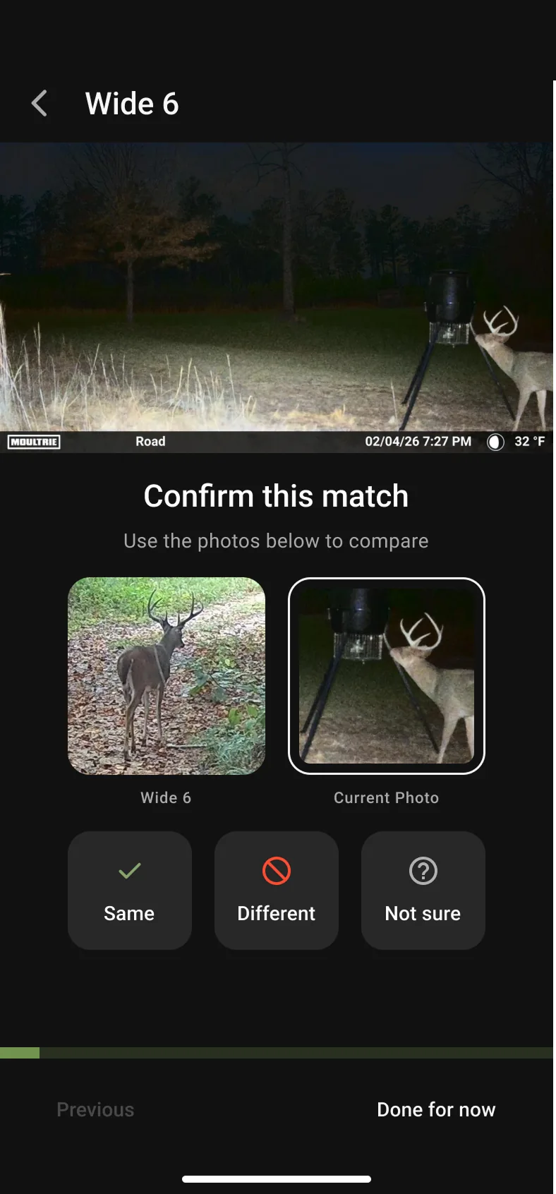
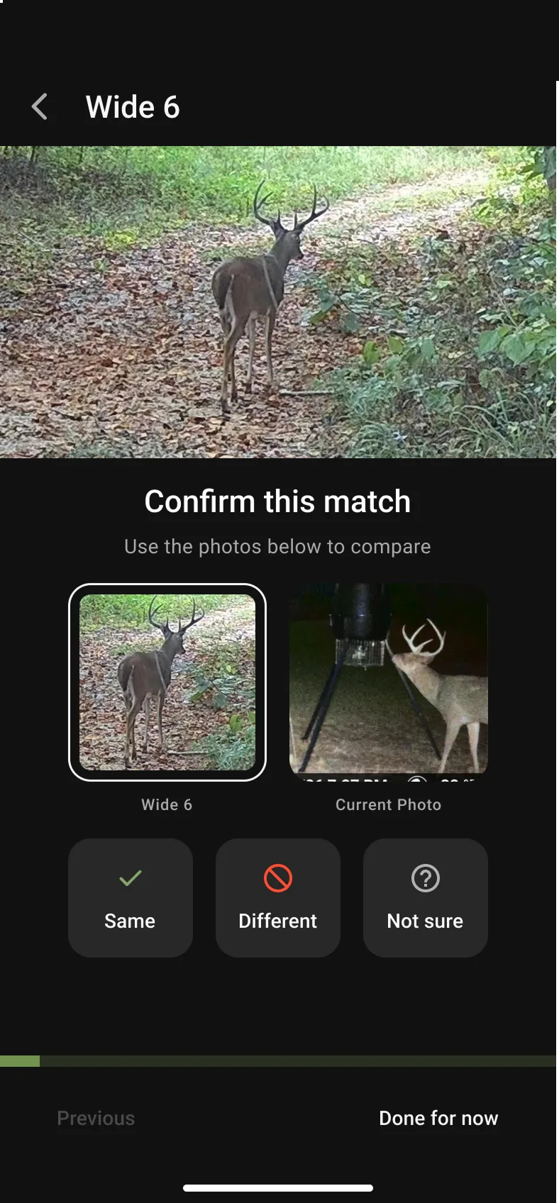
A Guided AI Confirmation Flow

For Phase 2, the goal was to make AI useful without making it autonomous.

considered A more automated approach — the case for it was real: confirmation adds steps to a workflow we'd spent the whole project removing steps from.
chose Users confirm before any match or new-buck flag is applied.
why A bad match quietly corrupts the data a hunter is planning around. A bad new-buck flag fills the list with noise. And in a system where user tagging is also training data, silent errors compound. A slower system users trust produces better data than a faster one they second-guess.

Adapting When the Plan Changed

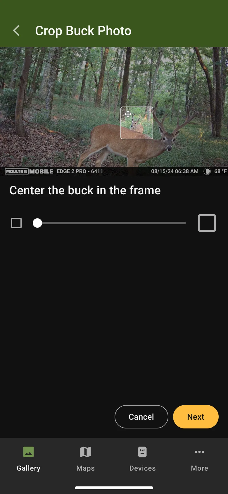
About three weeks before development started, a research spike came back with bad news. The bounding box data from smart tagging that we planned to use for automatic profile image cropping was not going to be available in a usable way.

Without automatic cropping, the fallback was full trail camera images as profile thumbnails. That creates two problems. Trail camera images often capture multiple deer, so a full-image thumbnail doesn’t tell you which buck a profile is for. And the app already uses full images as thumbnails for camera albums, so profile cards would have looked identical to an existing pattern while doing something different.

considered Full trail-camera images as profile thumbnails — the fallback once bounding box data fell through.
chose A manual crop step during profile creation.
why Full-image thumbnails are ambiguous when a frame contains multiple deer, and they collide visually with the existing camera-album pattern. A manual crop keeps the profile card legible as its own pattern, which everything downstream of profile creation depends on.

The fallback was on the table mostly because no single function had the full picture. ML understood why the bounding boxes failed, engineering understood the implementation cost of alternatives, the product owner understood the timeline, and design understood what the thumbnail problem would do to the experience. There was no real disagreement to overcome, just a gap in shared understanding, and closing that gap was the work. I made the case for a manual cropping step during profile creation and worked through the implementation with engineering. We tested a Syncfusion library first; it didn’t give us the control we needed and felt clunky. We moved to a custom solution, which took more refinement but gave us full control over the interaction. I simplified the controls, added a movable selection area, and reduced the precision the crop required.

The result wasn’t the automated experience we planned, but it kept the profile card legible as its own pattern, which everything downstream of profile creation depends on.


Outcomes

Phase 1 launched in time for opening day of deer season. Against the three targets:

Adoption: 27% against a 30% target. Close, but a miss, and worth being honest about. Profile creation is a new behavior with real upfront effort, and we shipped without a usability testing cycle that might have found friction we couldn’t see. I’d rather report 27% with that context than round it up to a win.

Identification: over 300,000 unique bucks against a 10,000 target. This is the raw identification count, and even accounting for the stricter “useful buck” definition in the original target, it cleared the bar by a wide margin. The supporting signal is just as important: images per buck grew from 2.7 to over 4 across the season, which is exactly the repeat-tagging behavior the useful-buck criterion was designed to measure. Users weren’t creating profiles and abandoning them. They were building records.

CSAT: still being collected at the time of writing.

Beyond the targets, the platform now holds a structured dataset of how individual animals move across a property, which cameras they appear on, and when they show up. That is what the survey said hunters wanted, and it is what Phase 2 needs to function. The 2025 season generated the training data, and AI-assisted identification is planned for the coming season.

From a business standpoint, the system adds meaningful value to Moultrie’s premium hunt planning subscription. Internal forecasts project $11.8M in new revenue in FY27, driven by acquisition and retention gains as the feature deepens what the subscription offers.


Reflection

The bounding box pivot taught me the most, and not because something went wrong. The problem only got solved because someone held all four contexts at once: what the model could do, what engineering could build, what the timeline allowed, and what the experience required. Nobody was wrong and nobody was blocking. The functions just couldn’t see each other’s constraints, and translating between them turned out to be the design work that mattered most on this project. That’s the kind of work I want more of.

The comparison flyout is where I’d push harder with another pass. It works for easy identifications and compromises on hard ones, and that’s exactly the kind of thing a usability testing round would have caught early. We didn’t have time before the season deadline. The triage flow shipped without instrumentation too, so I can’t tell you how bulk tagging performs against individual tagging, which is a gap I’d close before iterating on either. Both are the cost of the deadline, and both are things I’d fight for earlier in the schedule next time rather than treating as nice-to-haves that fall off the end.

Phase 2 is the real test of the strategy. Phase 1 proved users will do the manual work and that the data flywheel turns. Whether the model performs well enough to earn their trust is the open question, and it’s a hard one. Buck identification challenges experienced hunters working from good daylight photos. Doing it reliably from nighttime trail camera images is a different problem. The system was designed so that even when the AI is wrong, the user catches it before it costs them anything. The coming season will show whether that’s enough.